What are presentations?
A picture says a thousand words…I have been to more bad presentations than I can count with both fingers and toes. What I’m talking about are computer generated screen shows which are designed to support an oral report but more often than not, are merely a transcript of what the speaker is saying transitioned in every available way. In the past, presentations were simply slide or OHP presentations. Today they can be complex PowerPoint shows which, when well done, will not only reinforce visually what is being said, but will enhance this, helping your audience to focus attention, to be involved, to understand complicated concepts more quickly, to remember what is being said and one hopes, to be sold on it!
Why have your presentation professionally made? What difference does it make?
A poor presentation will detract from the speaker and what is being said. At best people will forget you and everything you said; at worst they will think you are either an idiot or an amateur. Unless you do it well, you are better off not to do it at all. Provide a poor presentation and your captive audience will simply be watching the ‘show’, reading ahead, lost in their own thoughts, distracted or trying to figure a slide out rather than watching and listening to you. Face it, if you don’t know what you’re doing or haven’t experienced a great presentation, then you shouldn’t be trying to create one yourself.
What makes great presentation ?
• The presentation should be appropriate for its target audience.
• The presentation should have consistency of style .
• There should be good contrast on the slides.
• Slides should have a common visual theme through colour and graphics.
• Slides should use an appropriate font(s) at legible sizes.
• Slides should be as clear and simple as possible.
• Text should be brief and to the point headings, keywords or summary points - not sentences and paragraphs.
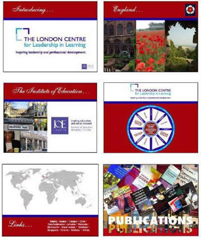
• Images should be relevant and memorable so that they enhance what is being said.
• There should be too few rather than too many slides.
• Slides should be timed correctly showing one point at a time to keep your audience at pace.
• Transitions should be consistent or they will be merely distracting.
Info-graphics can make a welcome and interesting change from basic charts and graphs.
• An element of wit or surprise, if appropriate, can help relax your audience and get them on board.
• Animation should be used frugally if at all and only where it really adds value and understanding.
• There should be no spelling or grammatical errors.
Your company branding should be discreetly included.
• The presentation should look as professional as the speaker and his/her service or product.
For a stunning presentation, speak to Yvette at EYEDEAS who is also trained and skilled in editing. She will design a theme with the appropriate mood, help you with content, and editing, create or source interesting graphics and photographs, prepare charts or infographics, and put together a brilliant presentation which will help you to win your audience’s undivided attention.
EYEDEAS © 2012